UX for science: optimising and expanding a scientific software suite
I designed several scientific data analysis tools used by scientists across a large international organisation, driving measurable improvements in usability and adoption rates.
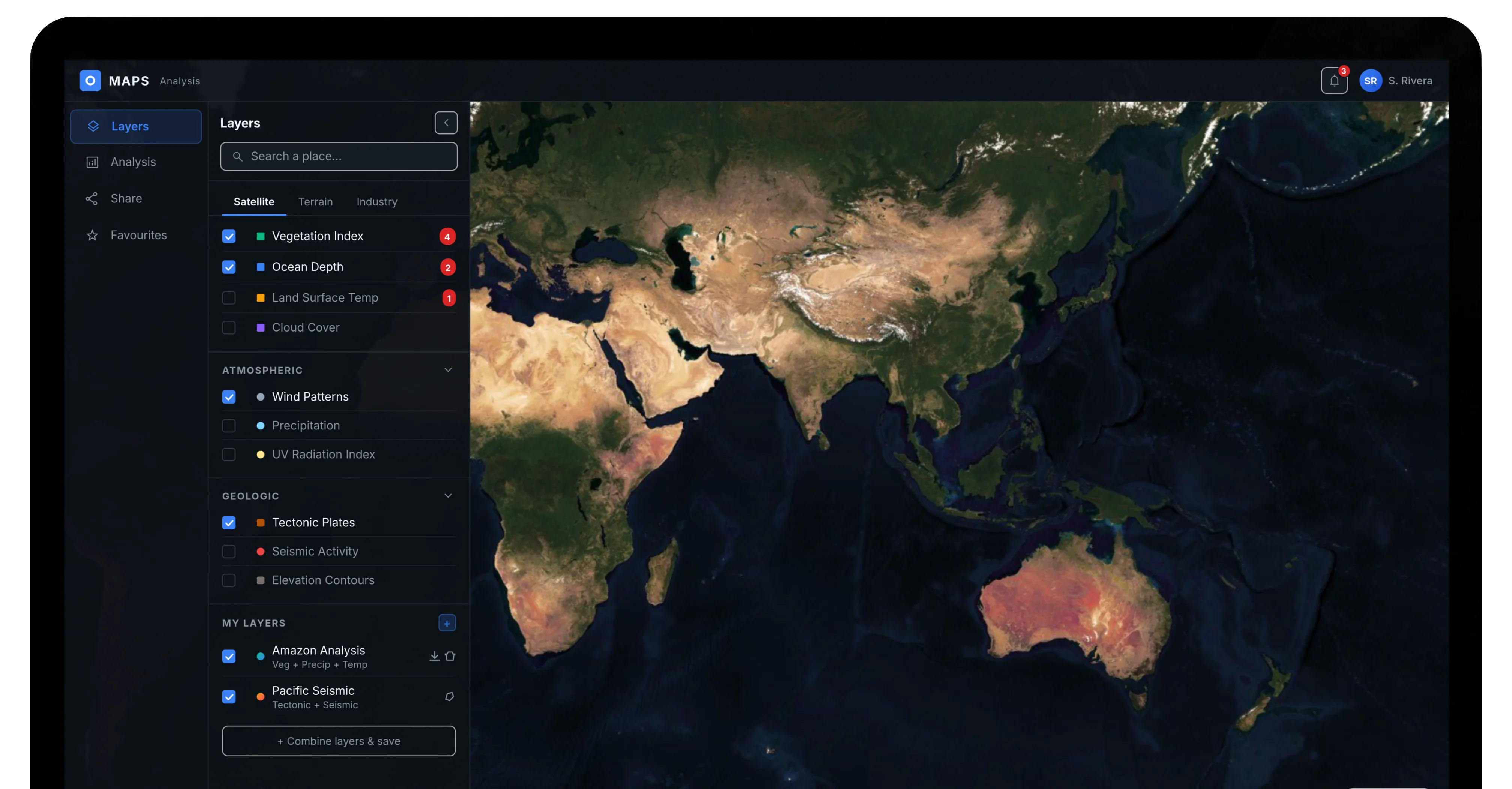
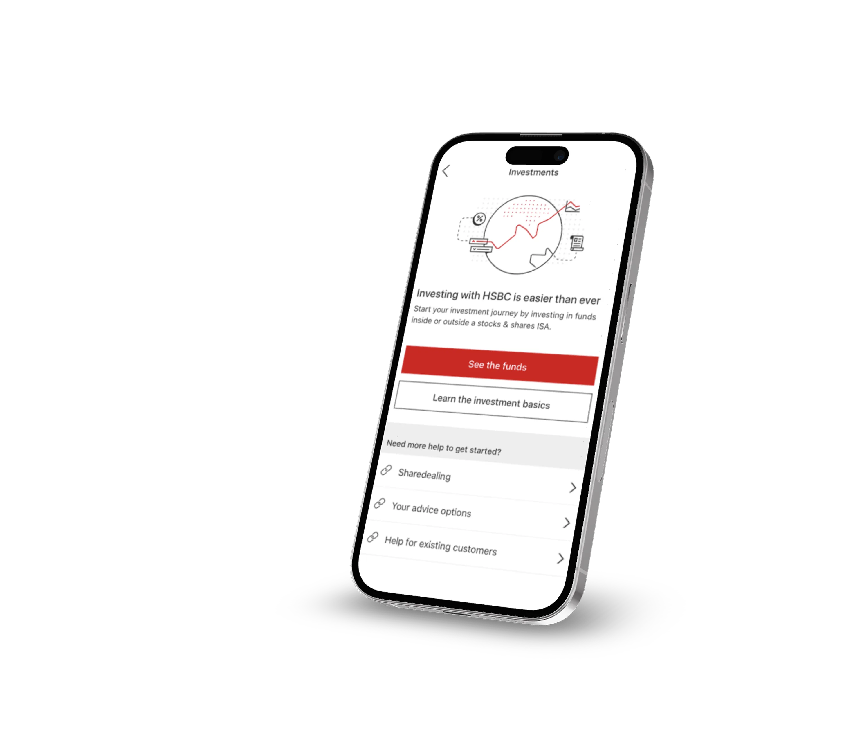
When the project was happening, AI design tools were not as widely available for project work yet. Due to client confidentiality, I'm also limited in how much real project work I can show publicly. So, while building this portfolio website, I took the opportunity to recreate a couple of the designs with AI — to explore new possibilities and showcase what I would produce if the projects were happening today.
Project summary
Bridging the gap between complex science and intuitive UX. Over three years, I successfully completed a comprehensive UX overhaul of a major legacy software tool, optimised two web applications, and designed several brand new products, all resulting in high employee satisfaction and business value. Additionally, I embedded a formal user-centred design process into the software development lifecycle of the client.
Impact & results
- Qualitative feedback showed how much employees appreciated the new approach, reporting they felt heard for the first time.
- Our improvements led to a 95% user adoption rate among the initial target groups, successfully transitioning usage from near-zero to standard practice.
- The success of the individual projects led to the integration of the full Design Thinking process into all software development projects throughout the organisation.
- One newly developed product was presented at a world conference.
The way there
A large international organisation asked for the modernisation and expansion of its scientific software suite, used by their scientists worldwide. The employees struggled with outdated software, leading to inefficient workflows, workarounds and reliance on external tools.
Deep dive into the world of physics
I facilitated stakeholder workshops, user interviews, and contextual inquiries to understand the complex organisational landscape and the users' daily challenges and needs. Heuristic audits further helped me identify usability and accessibility issues within the existing systems.

- Clunky and outdated software with steep learning curves that is difficult to use leads to a poor user experience and frustrated users.
- A lot of scientists have paper notes next to the computer reminding them of steps and how to get from A to B in the software.
- Some of the scientists build their own programmes because their needs are not covered in the offered software suite.
- Scientists with colour vision impairments are unable to fully utilise the software they need for work because the systems were not built with accessibility in mind and most data visualisation has a traffic light-based colour scheme.
- The systems are not connected, so users often have many applications running at once which slows down their machines significantly and also requires manual data transfer from one system to another.
- Inefficient workflows and the complex, non-intuitive UI cause significant time loss, resource waste, and unnecessary operational costs.
- The frustrating user experience and issues of the legacy software lead to low employee satisfaction, slow onboarding, and resistance to adoption.
- The outdated technical foundation restricts scalability and future-proofing, blocking the business from scaling operations and integrating new technologies.
Seeing the vast potential for optimisation, I focused on identifying quick wins first. This secured stakeholder support and was an effective way to introduce a human-centred design process into the organisation.
Deliverables
- Problem Analysis
- Heuristic UX Audit
- Product Design Strategy
- Research Execution, Analysis and Summary
Uncovering the big picture
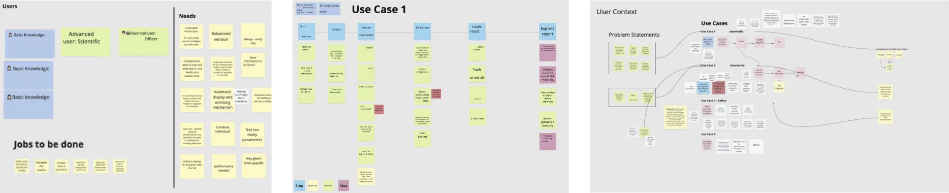
My research findings helped me to understand the complex system structure and further enabled me to:
- Define different user profiles with varying levels of experience and engagement with the software suite and associated use cases, to ensure designs directly addressed the needs and behaviours of distinct user segments.
- Map out where they operate in the complex ecosystem of the organisation to identify potential points of friction.
- Understand technical constraints to ensure the proposed solutions are feasible and can be implemented within existing systems.
- Refine the problem statement to prioritise improvements with the largest user and business value.

Junior Analyst
- Scientists in their late 20s – mid 30s
- Has been with the organisation for less than 5 years
- Uses the software that is given to them

Senior Analyst
- Scientists in their 50s
- Has been with the organisation for more than 5 years
- Has developed workarounds to avoid using outdated software

Technical Officer
- Technical personnel in their 40s
- Has been with the organisation for more than 10 years
- Oversees scientists' work and responsible for improving workflows

Field Operator
- Field personnel in their late 40s – 50s
- Has been with the organisation for more than 10 years
- Conducts standard operating procedures in the field
The understanding that the design needed to cater to several different users with varying levels of experience and engagement with the software suite. Some would use part of it, all of it or only one system. For this reason it was vital to map out all use cases in detail and understand who uses what, when and why.
For example employees who had only rare tasks using the system required a minimal interface and clear guidance and tooltips, to streamline their workflow and simplify onboarding. Scientists who used the system for detailed daily analysis on the other hand needed advanced options and the ability to bypass certain steps to maximise their efficiency.
I also closely analysed and defined non-functional requirements with the development team to uncover further opportunities beyond the obvious usability issues. We found that especially in the field of accessibility and aesthetics we had some quick wins.
Deliverables
- Research-based Personas
- Use Cases
- User Scenarios
- Problem Statement
- Requirements Summary
First the low hanging fruit
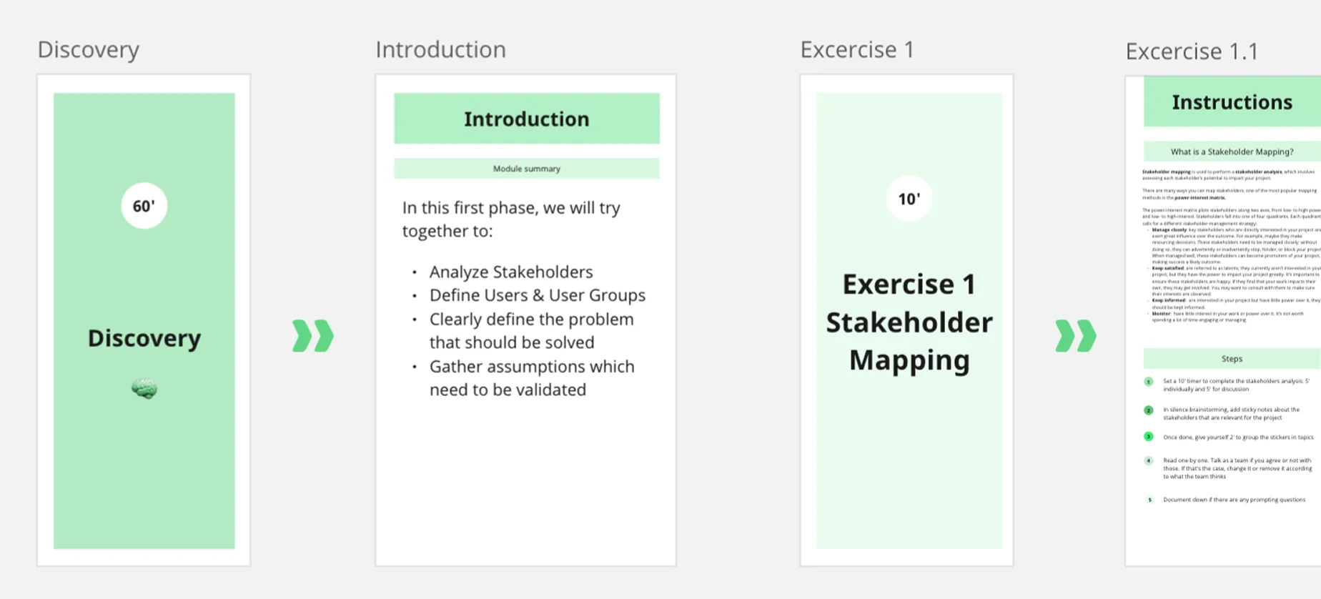
I facilitated ideation and requirements workshops with product owners and the engineering teams to generate and prioritise ideas and foster stakeholder alignment.
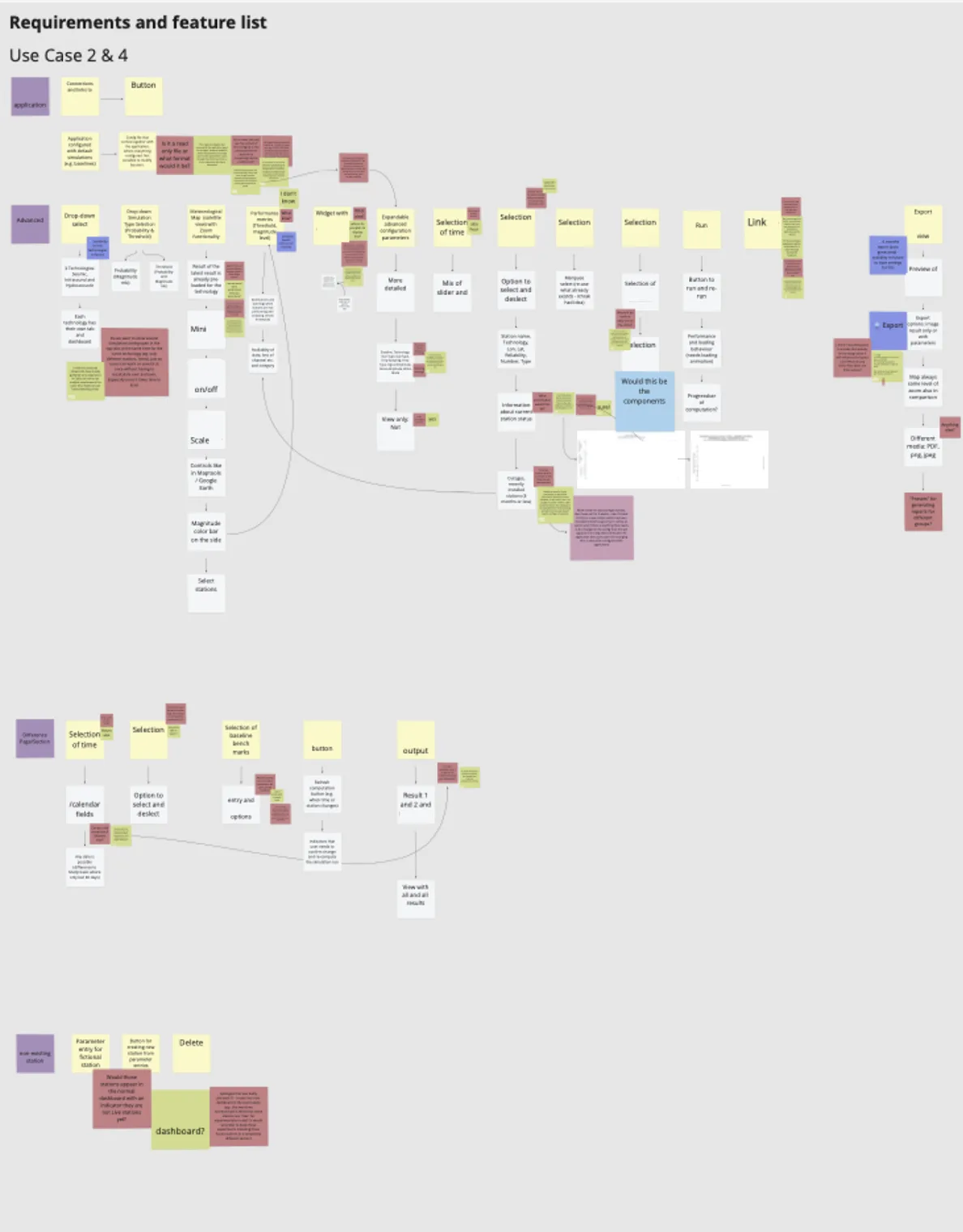
I then continuously evaluated and refined potential solutions through prototyping and testing, across the entire suite. The final designs placed a strong emphasis on information architecture, error prevention, and clear UX copy.
Limited user access during testing
A key challenge in this phase was gathering frequent feedback from less experienced users, as my access was primarily limited to super users and experienced staff.
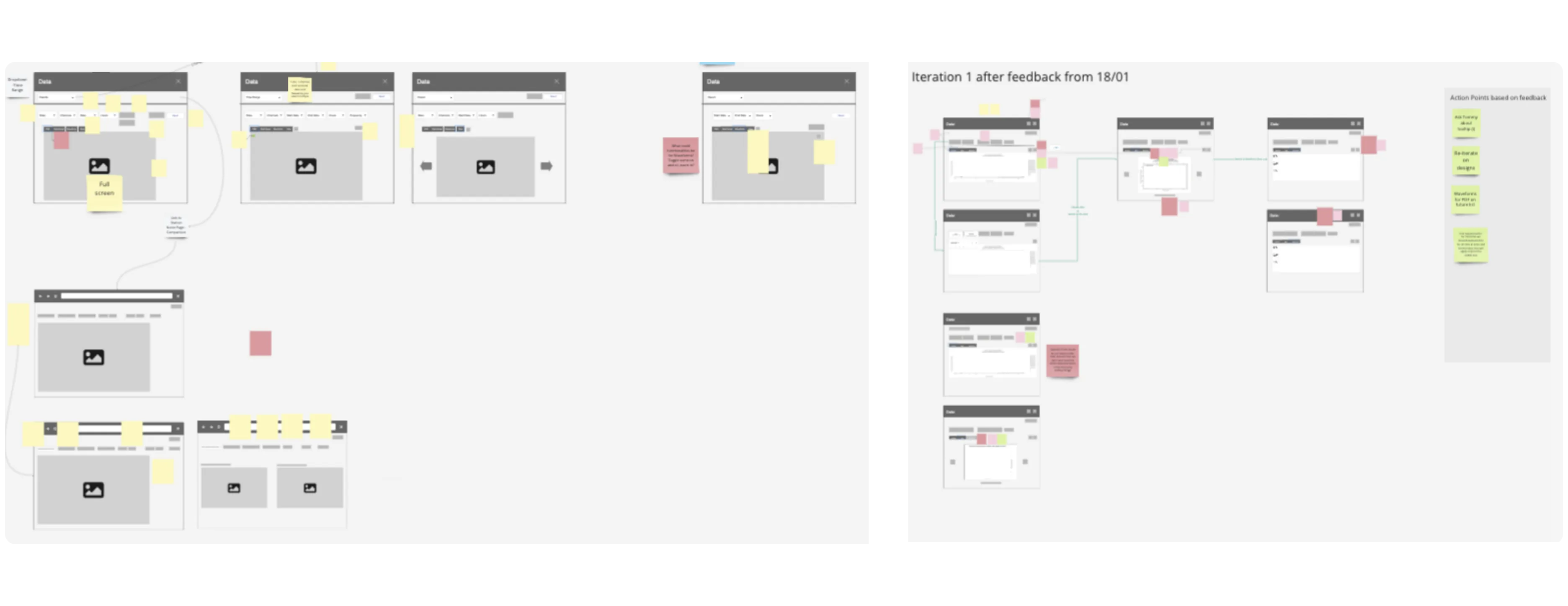
Distributed prototype testing
I compromised by creating shareable, clickable prototypes that could be distributed to groups of users with varying experience levels. They then tested the prototype and wrote feedback down in their own time and sent it to me.
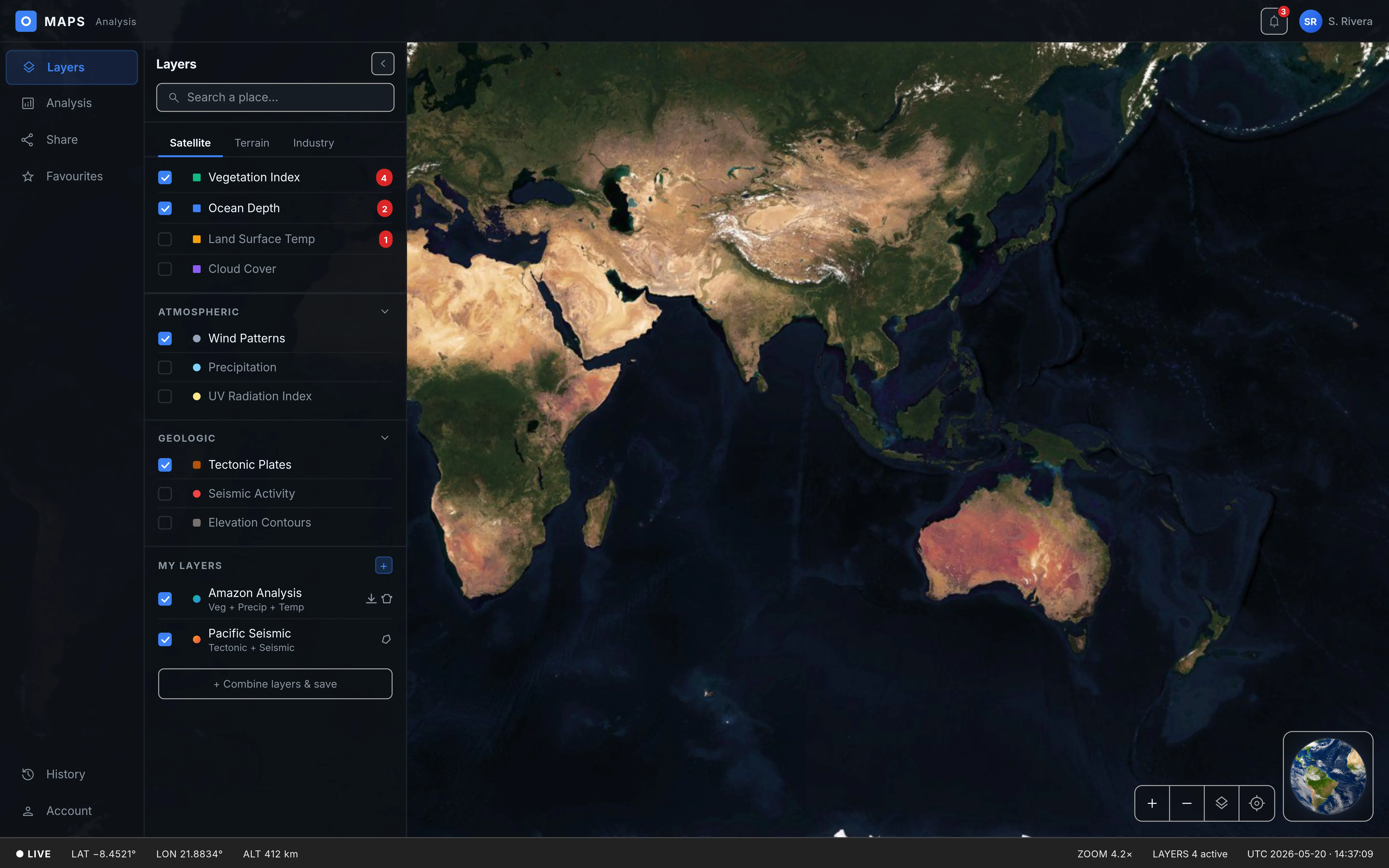
It was also through this approach that I learned about several employees struggling with the traffic-light based data visualisations due to their colour vision impairment.
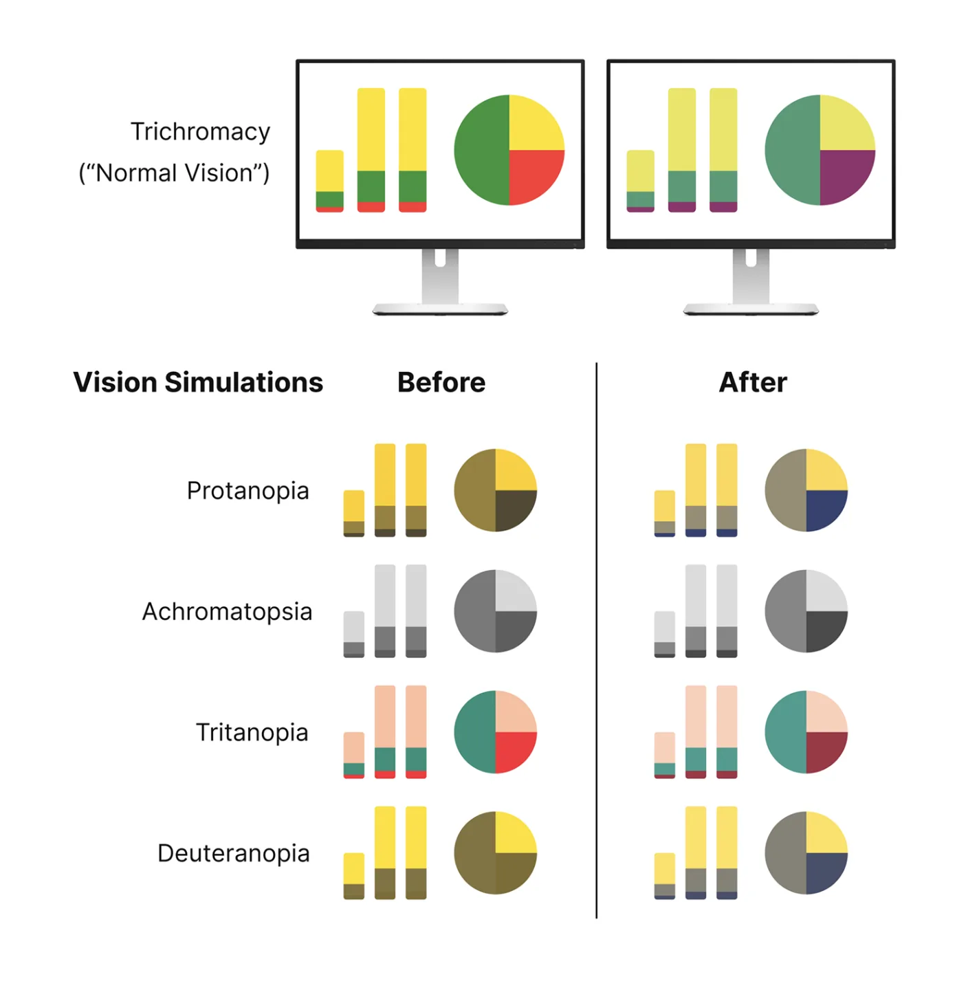
This clear evidence demonstrating the negative user impact of the existing scheme enabled stakeholders to confidently authorise the shift to a colour-blind safe palette in data visualisations, dramatically improving accessibility and user experience across the board. Further improvements involved usability issues with the largest impact on user satisfaction, such as essential functionality often being completely hidden behind right-click menus, leading to a confusing and frustrating experience.
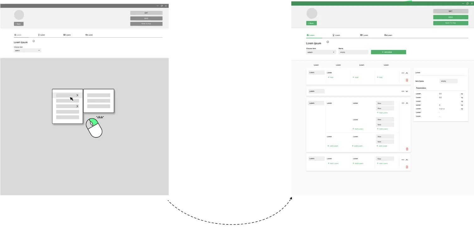
Another quick win was improving the systems with more user-friendly copy and heuristic best practices such as error prevention. The old systems were missing safeguards to prevent errors, so users could easily lose their work by accidentally clicking the wrong thing. Error handling was also limited to technical system messages that were often convoluted, offering little to no help to users.
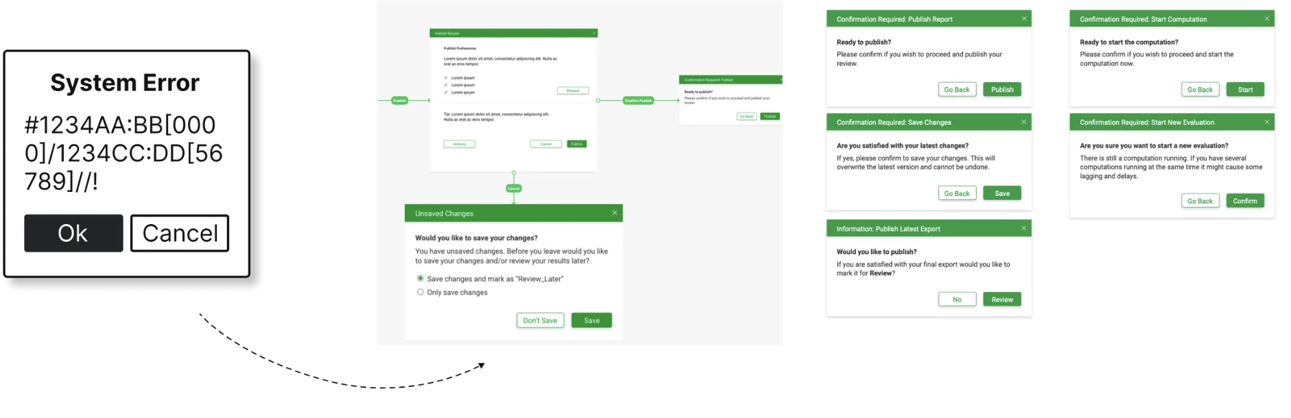
To improve this, I minimised error-prone situations, provided tools like confirmation windows and "Reset" options, and rewrote all error messages in clear, user-friendly language with direct solutions.
I adopted a phased approach to deliver incremental value, starting with low-hanging fruit — small, low-risk changes for immediate implementation — while sketching future visions for the backlog. One such large change was connecting the various software products into one suite from which users could access all applications.
From a technical viewpoint, this strategy helped de-risk development by allowing the team to tackle high-impact changes without immediately overhauling the entire legacy system.
Deliverables
- Workshop Facilitation
- User Flows
- Wireframes
- Rapid Prototyping & Testing
What I'd do differently
I would have pushed for more quantitative ways to measure the user experience and evaluate factors such as productivity, friction reduction and workforce satisfaction. Task Success Rate and Error Rates would have been helpful in getting tangible scores about the efficiency of the new implementation. Time to Productivity, a System Usability Scale and also a Customer Effort Score (modified for internal use) would have also been great tools to measure engagement and satisfaction metrics.
To overcome the client's strict boundary around employee access, I would proactively shift the conversation from 'user research' to risk management and cost reduction. If active testing was still completely blocked, I would advocate for implementing passive analytics like tracking automated event logs which require zero employee time but still surface quantitative friction.
Delivery & launch
I was working with a two-pronged approach — launching large changes such as whole new features every couple of months, and minor adjustments to the user interface such as button placements, font sizes and UX copy every new sprint. I actively collaborated with the development team after design handoff, providing support and quickly addressing any challenges that came up as well as updating the user stories.
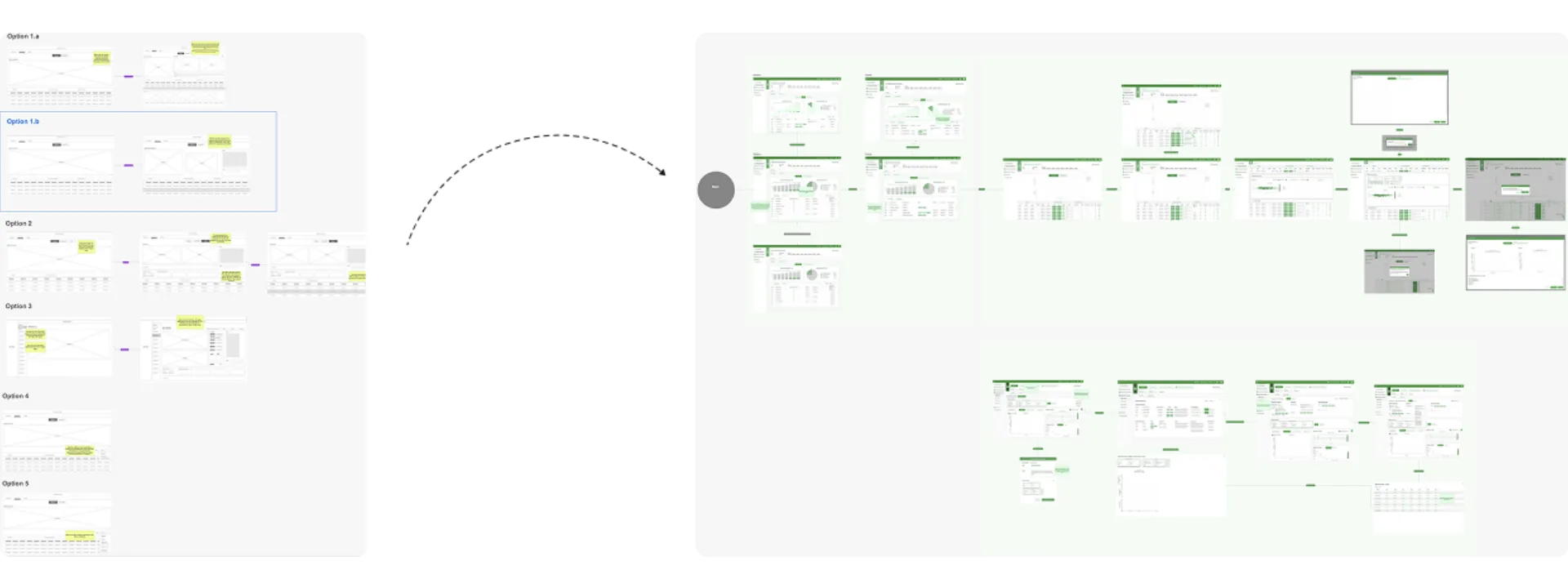
Prototyping data visualisation tools
Most of the software products were data visualisation tools which proved difficult in the UX prototyping space.
Staging & post-launch iteration
We had super users testing the applications in the staging environment, and also relied heavily on user feedback gathered post launch to iterate on design and keep enhancing the software for future releases.
The optimisation of existing tools to improve employees' daily work experience, streamline workflows and enhance usability — and the development of new systems to fill gaps in functionality.
Towards the end of my time on the project I started the design of two new software products from the ground up using the newly embedded Design Thinking workflow.
The project resulted in significant usability improvements across the software suite, increased willingness to invest in UX and ultimately a more positive user experience.
Deliverables
- Screen Flows
- UI Designs
- Design System
- User Stories
- Development Handover

My personal highlight
After working on the project for a while, we received feedback that employees felt heard for the first time, which was incredibly rewarding. It's a reminder of why we do what we do as experience designers, and I'm grateful for the opportunity to make a difference.